Why do some hotel lobbies, luxury boutiques and premium residences look expensive even when they use relatively few materials, while other spaces filled with marble, brass and decorative furniture still feel visually ordinary?
The answer is rarely the price of one material. It is usually the relationship between materials.
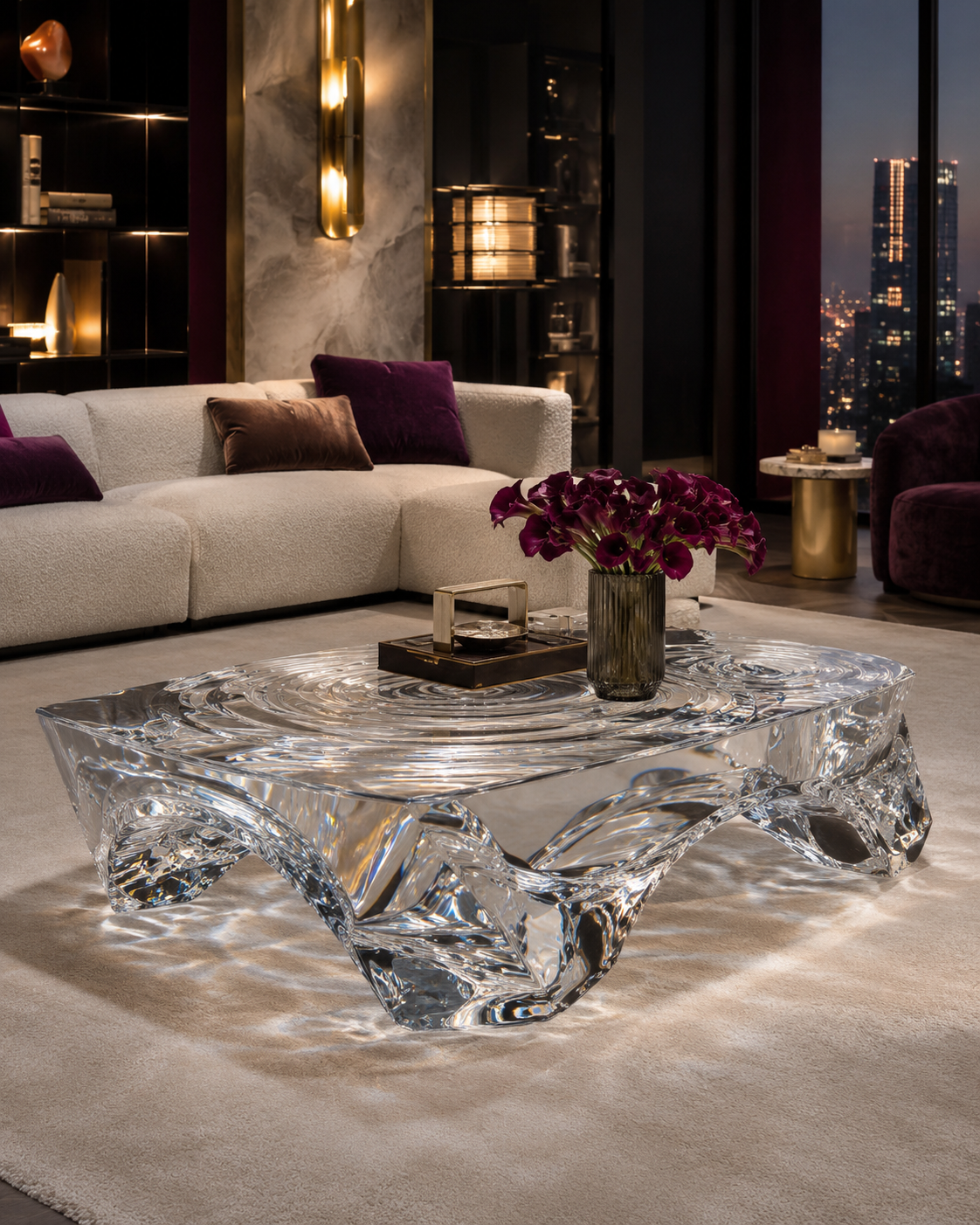
In sophisticated interiors, designers often combine visually heavy surfaces with visually light ones: stone beside transparent resin, brushed metal beside synthetic crystal, or warm neutral fabrics around a platinum acrylic coffee table. Instead of allowing every element to compete for attention, the palette establishes hierarchy.
This has become particularly relevant as luxury increasingly shifts toward experience. Bain & Company and Fondazione Altagamma estimated global luxury spending at approximately €1.44 trillion in 2025 and reported that consumers continued to prioritize experiences over possessions. Bain also argued that luxury brands need physical retail environments capable of delivering greater emotion, immersion and personalized connection. JLL, meanwhile, reported that newly opened U.S. luxury retail square footage increased 65.1% year over year in the first half of 2025.
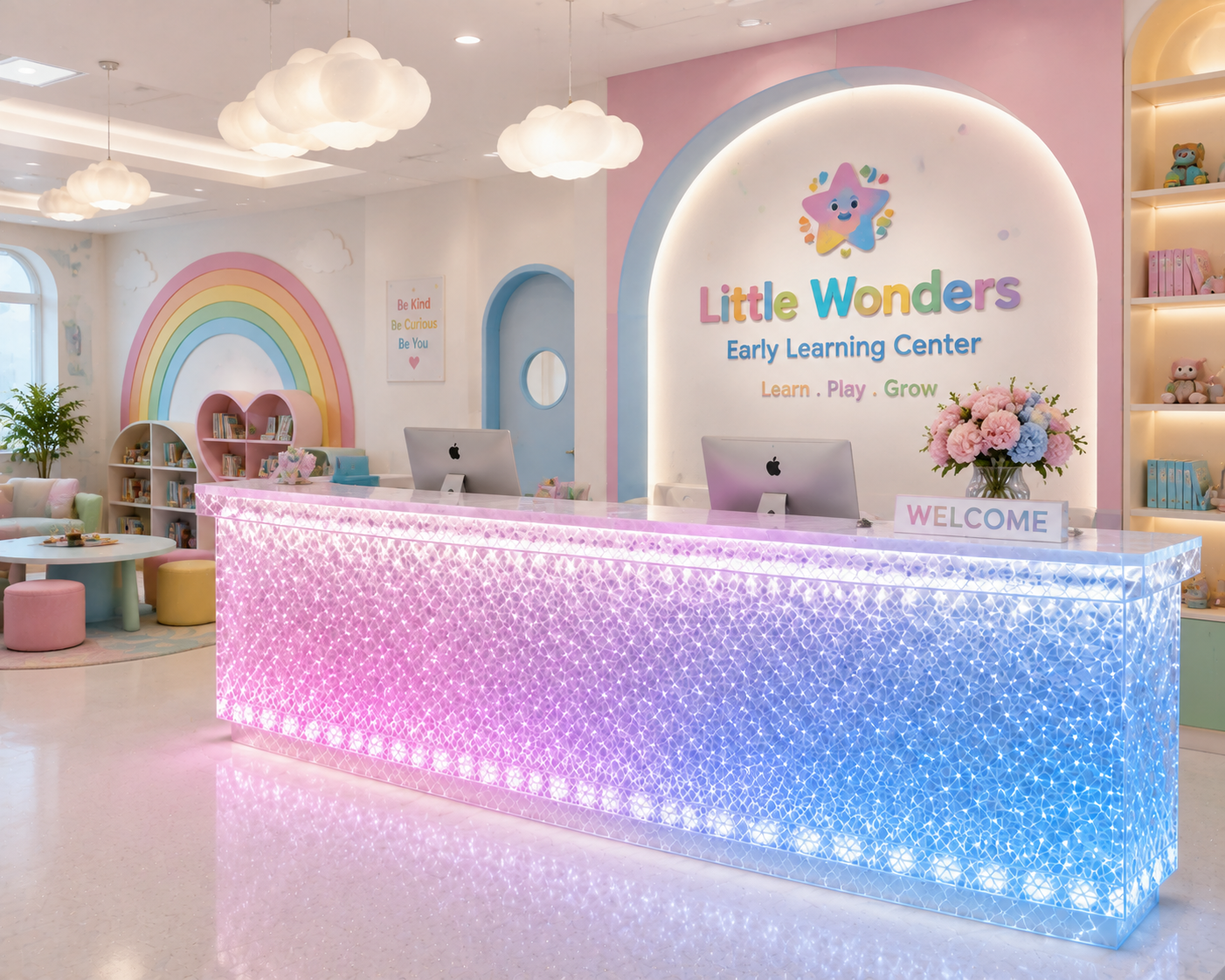
For architects, interior designers and commercial buyers, furniture is therefore not simply equipment placed inside architecture. A synthetic crystal side table, high-end resin reception desk or platinum acrylic display table can influence how customers perceive the quality of the entire environment.
The secret is not transparency alone. It is how transparency is paired with weight, texture, color and light.
1. Expensive-Looking Interiors Are Usually Built on Controlled Contrast
Luxury interiors rarely depend on making every surface visually impressive at the same time.
If the floor is strongly veined marble, the wall is polished brass, the sofa is highly saturated velvet and the coffee table is another visually dominant material, the space may contain expensive individual components but still feel noisy.
Premium spaces typically establish contrast more selectively.
A thick block of stone creates physical and visual weight. Brushed stainless steel contributes precision and reflection. Timber adds warmth and grain. Transparent resin, synthetic crystal and premium acrylic introduce the opposite quality: visual lightness.
That contrast is one reason transparent furniture can work so effectively in luxury projects.
Imagine a hotel lobby with cream limestone flooring, dark walnut wall panels and bronze architectural details. A large opaque coffee table made from additional stone could make the central seating area feel heavy. A clear or lightly champagne-tinted high-end resin coffee table performs the same functional role while allowing the floor, rug and surrounding furniture to remain visible.
The table is physically present but visually less obstructive.
The effect becomes even stronger when transparent furniture has substantial thickness. A thick synthetic crystal side table can feel solid and valuable while remaining optically light. This combination—physical mass without equivalent visual mass—is difficult to create with timber, metal or stone alone.
The principle also applies in retail. A luxury jewelry store might use stone walls and metal display detailing while placing merchandise on clear platinum acrylic or synthetic crystal pedestals. Instead of introducing another strong material, the transparent furniture supports the product.
This is increasingly relevant when physical retail itself has to justify the customer's visit. Bain's 2025 luxury research argues for fewer but more emotionally engaging and immersive flagship environments. In such spaces, material restraint can communicate confidence more effectively than excessive decoration.
A space often looks expensive not because it contains more luxury materials, but because the designer knows which materials should speak and which should remain quiet.

2. Transparent Furniture Gives Stone Room to Feel More Luxurious
Stone already has strong visual characteristics.
Marble may contain dramatic veins. Travertine has pores and linear movement. Granite has mineral variation. Limestone can create large continuous surfaces with subtle natural texture.
When stone is used extensively, furniture selection becomes critical because another opaque material can interrupt the continuity designers are trying to create.
Transparent furniture solves this problem particularly well.
Consider a premium residential sales gallery with a large travertine floor. A conventional dark timber coffee table visually creates another rectangle on top of the stone. A clear platinum acrylic table allows the travertine pattern to continue through the furniture. The room appears more open, while the table still establishes the seating area.
In a hotel bathroom or spa reception area, a champagne resin console can complement beige limestone without duplicating it. Because the resin remains translucent, the relationship is based on tone rather than imitation.
This distinction matters.
Luxury spaces usually become more convincing when materials retain their own identities. High-end resin does not need to pretend to be marble. Synthetic crystal does not need to imitate glass. Platinum acrylic does not need a printed stone pattern to appear valuable.
Instead, transparent materials can make natural stone appear more important by providing contrast.
A sculptural amber resin side table beside pale travertine creates warmth and depth. A smoke-grey synthetic crystal console against white marble adds a darker architectural layer without completely covering the stone. A crystal-clear acrylic bench or display pedestal allows complex stone veining to remain visible.
Optical quality becomes especially important in these applications. ASTM D1003 is the recognized test method for haze and luminous transmittance in essentially transparent plastics. ASTM notes that scattered light can create a hazy or smoky appearance and that haze and transmittance measurements are useful for material specification and quality control.
That is directly relevant when transparent furniture is placed beside premium stone. If a supposedly clear table appears cloudy, the contrast changes from “light versus solid” to “plastic versus stone.”
When clarity is controlled, however, the relationship feels intentional: stone supplies geological mass, while transparent furniture supplies optical space.
3. Metal and Transparent Materials Create Precision Without Excessive Visual Weight
Metal introduces another type of contrast.
Where stone communicates mass and natural variation, metal usually introduces sharper lines, controlled surfaces and reflected highlights. This makes metal particularly compatible with synthetic crystal, high-end resin and platinum acrylic.
The two material groups react to light differently but can visually reinforce one another.
For example, a clear resin console with brushed stainless-steel details can appear sharper because the metal defines its geometry. A platinum acrylic dining table with bronze connectors can gain warmth and craftsmanship without requiring an opaque metal base. A synthetic crystal reception desk with carefully integrated champagne-metal trim can bridge contemporary transparency and classic luxury finishes.
The choice of metal changes the personality.
Polished chrome or stainless steel tends to make clear and smoke-grey transparent furniture feel cooler and more architectural. Brass and bronze make champagne and amber resin feel warmer. Blackened metal can give clear furniture stronger graphic definition.
The important factor is proportion.
When too much shiny metal is combined with highly reflective acrylic, the interior can become visually restless. Reflections begin competing with each other. In premium projects, metal is often more effective when used as an accent: a connection detail, frame, foot, trim line or lighting element.
This allows the transparent material to remain dominant while metal communicates construction precision.
Edge quality also becomes highly visible. Premium acrylic demonstrates how technically controlled transparency can be. PLEXIGLAS reports visible light transmission of up to 92% for its clearest products, while its Optical 0Z024 technical data lists 92% transmission at 3 mm and haze below 1% for that specific grade. These values should not be assumed for every acrylic product, but they illustrate why optical quality can be specified rather than described simply as “clear.”
For furniture manufacturing, this matters because polished transparent edges beside precision metal immediately expose fabrication quality.
A clean acrylic-to-metal connection can look almost jewelry-like. A cloudy edge, oversized fastener or inconsistent joint can make exactly the same material combination look inexpensive.
High-end design therefore depends less on adding metal than on controlling how metal meets transparency.

4. Low-Saturation Colors Let Materials Become the Main Attraction
Another pattern appears frequently in sophisticated interiors: designers reduce color saturation when materials themselves already provide strong visual interest.
This does not mean luxury interiors must always be beige or grey. It means color is often controlled so that stone texture, transparency, reflections and furniture form have enough visual space to be appreciated.
Research supports the idea that color response is more complex than simple rules such as “blue is calming” or “red is exciting.” A systematic review of 132 peer-reviewed studies covering 42,266 participants across 64 countries found reliable color-emotion associations, but also found that lightness and saturation play important roles in those responses.
For interior design, the practical implication is that saturation should be considered alongside hue.
Imagine a lobby combining travertine, brushed brass and a clear resin reception table. Highly saturated red lounge chairs would immediately become the visual priority. Change those chairs to muted terracotta, taupe or dusty rose and the viewer begins noticing the relationship between stone, transparent furniture and warm metal instead.
The room becomes more layered rather than merely more colorful.
Transparent furniture works particularly well within these low-saturation palettes because its own color can also be restrained. Smoke grey, pale amber, champagne, tea brown, subtle blush and crystal clear can introduce tonal differences without creating large opaque blocks of color.
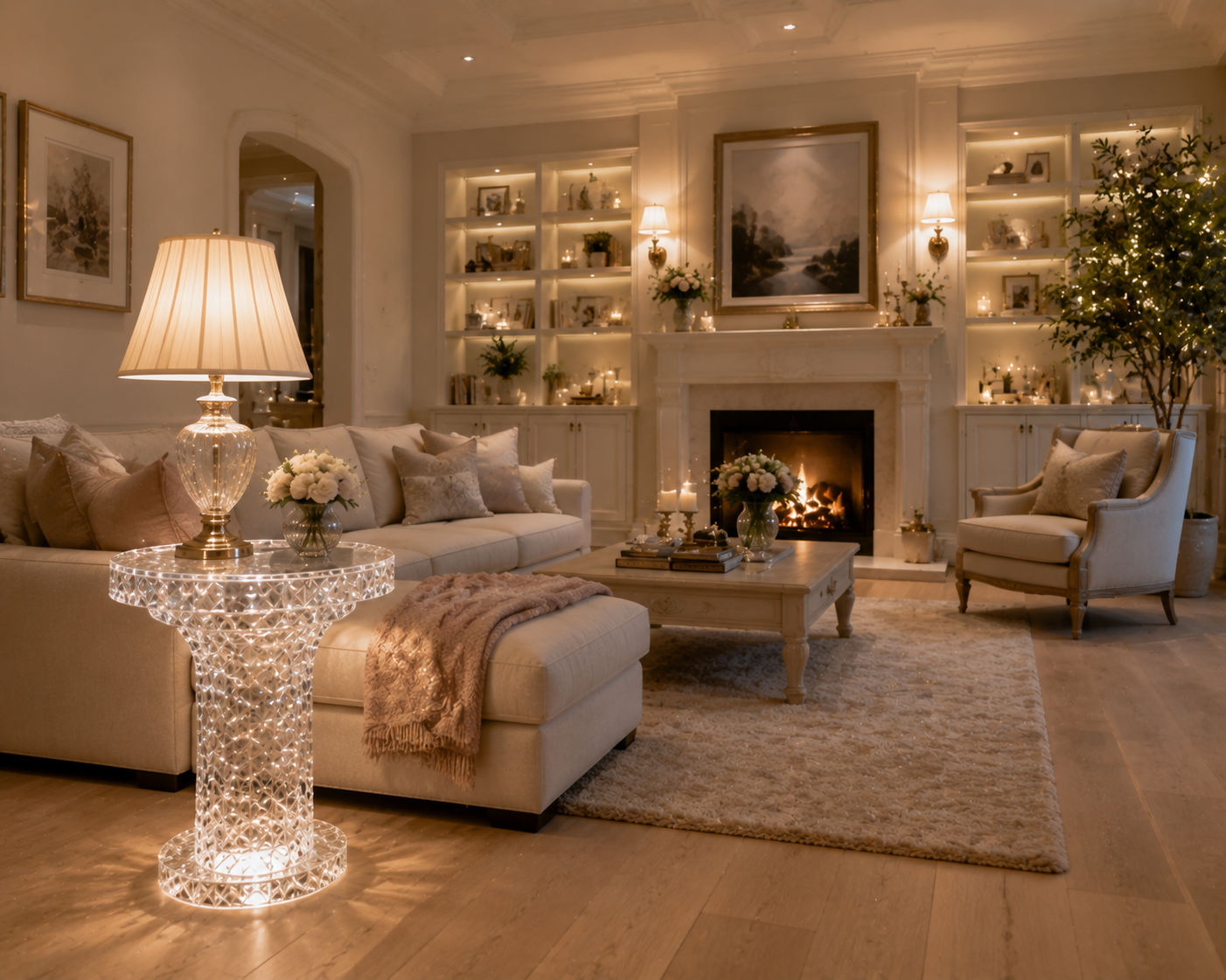
A champagne synthetic crystal side table beside ivory upholstery can provide warmth without feeling decorative. Smoke-grey platinum acrylic can complement charcoal stone while retaining visual openness. A clear high-end resin coffee table can effectively become a neutral material, allowing the colors underneath and behind it to remain visible.
This also gives designers flexibility when merchandise is supposed to supply the strongest color.
In a fashion boutique, transparent display furniture can support changing collections without forcing the store to redesign its entire palette every season. In a cosmetics store, pale resin pedestals can sit behind packaging of many colors. In a jewelry showroom, clear acrylic or synthetic crystal keeps attention on gemstones, metals and watches.
Low saturation therefore does not mean lack of personality.
Used intelligently, it transfers personality from surface color to material depth, proportion, texture and light.
5. Light Connects Transparent Furniture, Metal and Stone Into One Material System
The same furniture can look completely different under different lighting.
This is especially true when an interior combines transparent material, reflective metal and textured stone. Each responds differently to incident light.
Stone reveals texture through highlights and shadows. Metal produces sharper reflections. Transparent acrylic or resin can transmit, refract and reflect light simultaneously.
Lighting therefore becomes the element that visually connects the three.
The U.S. Department of Energy explains that the IES TM-30 method evaluates light-source color rendition using a much broader system than traditional CRI alone. TM-30 uses 99 color evaluation samples and provides information about fidelity, gamut and hue-specific changes. DOE guidance also notes that different light sources can make architectural scenes appear more vivid, dull, natural or distorted.
In practice, this means a material palette should ideally be reviewed under the project's actual lighting.
Consider an amber high-end resin table beside bronze and beige stone. Under warm lighting, the table may become richer, allowing the bronze and resin to visually connect. Under significantly cooler lighting, the amber may appear cleaner and less intimate.
A smoke-grey platinum acrylic console with polished stainless steel may benefit from controlled directional light. Highlights on the metal and polished acrylic edges create enough contrast to prevent the furniture from looking dark or flat.
Clear furniture offers even more possibilities. Certain PMMA grades are specifically engineered for light-guiding and edge-lighting applications; PLEXIGLAS Optical documentation, for example, identifies long-path light transmission and edge lighting as intended uses for its optical grade.
That principle can inspire furniture design. Concealed LEDs beneath an acrylic reception desk, synthetic crystal bar counter or transparent retail pedestal can cause selected edges to glow without adding another decorative material.
The best result is usually subtle.
Lighting should reveal thickness, polished surfaces and material transitions—not make every transparent object behave like illuminated signage.
When lighting is carefully controlled, metal supplies highlights, stone supplies texture and transparent furniture carries light between them. The space feels coherent because the materials are responding to one lighting language.
6. The Real Secret of “Looking Expensive” Is Editing, Proportion and Execution
The final reason designers like combining transparent furniture, metal, stone and low-saturation colors has little to do with any single material.
The combination creates opportunities for restraint.
A luxury hotel lobby may need only one sculptural high-end resin coffee table between two quiet sofas. A flagship boutique may use clear platinum acrylic pedestals rather than filling the floor with opaque cabinetry. A restaurant may place a few amber synthetic crystal side tables beside stone and bronze rather than repeating a decorative material throughout the room.
This is where premium interior design separates itself from simple material accumulation.
The furniture still has to be manufactured correctly.
Transparent pieces should be examined through their actual thickness. Large resin castings should be checked for unwanted bubbles, inclusions and inconsistent pigmentation. Acrylic edges should be properly finished. Metal joints should appear deliberate. Colors should be approved alongside actual stone samples rather than from photographs.
Long-term appearance also deserves attention. ISO 17223:2026 specifies an instrumental method for measuring yellowness index and changes in yellowness index for clear, translucent and opaque plastics; the standard notes that changes can be used to evaluate environmental effects such as heat and UV exposure on color stability.
That matters in a commercial project because clear is only luxurious when it remains visually clean. Champagne should be an intentional color, not the eventual appearance of an originally colorless piece.
Designers and buyers should therefore think of transparent furniture as an architectural material rather than an accessory.
A custom synthetic crystal console can establish the transition between stone flooring and metal wall panels. A high-end resin reception desk can introduce sculptural mass without blocking the room. A platinum acrylic coffee table can preserve a premium rug's visibility. Clear display plinths can keep luxury merchandise at the center of attention.
None of these effects depends on transparency alone.
They depend on the relationship between solid and transparent, rough and polished, warm and cool, reflective and matte, saturated and restrained.
That relationship is ultimately what makes a space feel expensive.
A premium interior does not need every material to demand attention. Stone can provide permanence. Metal can provide precision. Low-saturation colors can provide calm. Transparent synthetic crystal, high-end resin and platinum acrylic furniture can provide visual breathing room while connecting the other materials through light.
When these elements are properly balanced, customers may never consciously think, “This transparent table makes the room luxurious.”
They simply feel that the space is more refined.
And that is often the strongest expression of luxury design: the materials are noticeable, but the effort behind them is not.
READ MORE:
- Smoke Grey, Amber, Champagne or Clear? What Different Resin Furniture Colors Do to the Atmosphere of a Space
- From Material Presence to Premium Appeal: The Color Logic Behind Synthetic Crystal and High-End Resin Furniture
- Transparency Is Not Cheap: How Platinum Acrylic Furniture Elevates Interiors Through Color and Light
- How Can Commercial Spaces Avoid Looking Cheap? Start with the Color and Clarity of High-End Resin Furniture
- Synthetic Crystal Acrylic Furniture: A Material Trend That Cannot Be Ignored in the Future of High-End Design
- Why Can One Crystal-Grade Acrylic Furniture Piece Transform the Perceived Value of an Entire Space?
- Synthetic Crystal Acrylic Furniture: The Differentiated Answer the High-End Home Market Is Looking For
- From Transparent Aesthetics to Brand Elevation: How Synthetic Crystal Acrylic Furniture Enhances Product Positioning
- Synthetic Crystal Acrylic Furniture: Why High-End Clients Increasingly Value the Emotional Power of Material


