
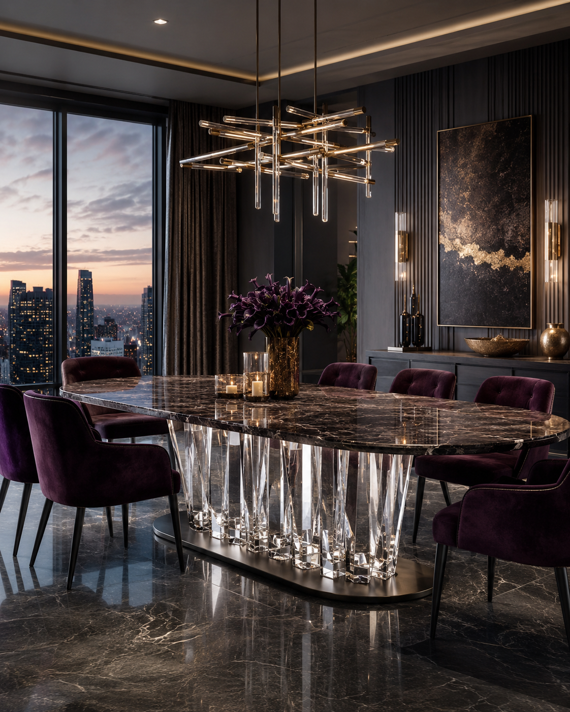
Luxury furniture is not defined by material cost alone. A large transparent table may use a significant amount of premium resin, synthetic crystal or acrylic, yet still fail to look sophisticated if its color feels accidental, its transparency appears cloudy, or it conflicts with the lighting and finishes around it. By contrast, a carefully tinted resin side table or crystal-clear acrylic console can elevate an entire interior because its color, optical depth and interaction with light have been considered as part of one visual system.
This distinction has become increasingly important in commercial design. JLL's 2025 research into retail experience surveyed 2,002 consumers across 15 countries and found that customers increasingly expect stores to feel relevant to their individual tastes rather than simply provide visual spectacle. Its broader 2025 consumer research, based on 12,000 respondents across 19 markets and 64 cities, also found that 72% expected retail destinations to provide events and in-store experiences. Materials and furniture are therefore part of the experience a customer uses to judge a hotel, boutique, restaurant or luxury brand.
For manufacturers and buyers of synthetic crystal furniture, high-end resin furniture and premium or “platinum-grade” acrylic furniture, color selection should consequently go far beyond choosing a attractive swatch. The goal is to transform material presence into premium perception.
1. Premium Color Begins With Material Depth, Not With a Color Name
One of the biggest differences between ordinary furniture finishes and transparent materials is that transparent color exists in three dimensions.
When a metal cabinet is painted champagne or a timber panel is stained brown, people primarily perceive the surface. With transparent resin, synthetic crystal or premium acrylic, light enters the material, travels through its thickness and exits from another surface. What the customer sees is therefore influenced not only by pigment but also by depth, clarity, reflection and refraction.
This is why the same “champagne” formula can look almost colorless in a thin sample and substantially warmer in the 60-mm leg of a resin coffee table. An amber sample that feels restrained at 10 mm may become noticeably orange when cast into a thick sculptural side table.
For premium projects, color should therefore be approved at a thickness that represents the final furniture rather than from a small flat chip.
The science behind transparent materials supports this approach. ASTM D1003, the established test method for haze and luminous transmittance in transparent plastics, explains that light scattered while passing through a material can create a hazy or smoky appearance. ASTM specifically identifies haze and luminous-transmittance data as useful for quality control and material specification.
In practical furniture terms, color and clarity cannot be separated.
Imagine two smoke-grey resin consoles positioned in a luxury hotel lobby. Both technically use the same grey family. One contains controlled pigmentation and excellent optical clarity, so light travels through the thick legs and creates elegant gradients. The other is slightly cloudy. Its color appears flatter, darker and more plastic-like.
The problem is not grey versus grey. The problem is the way the material carries grey.
The same principle applies to synthetic crystal dining tables, clear resin stools, acrylic display plinths and large reception counters. Premium furniture should create layers of color: lighter through thin sections, deeper through thick sections, and more concentrated along polished edges. Those natural variations generate visual depth without requiring decorative patterns.
This is the first rule of high-end transparent furniture: do not select a color without understanding how the material itself will express that color.
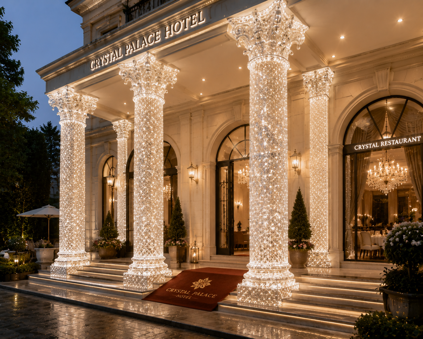
2. A Luxury Palette Is Usually Controlled Rather Than Complicated
A premium interior does not necessarily need more colors. It needs better relationships between colors.
This is especially relevant to resin and synthetic crystal furniture because transparent materials already create visual complexity through reflections and changes in depth. Adding too many unrelated hues can quickly make the space feel decorative rather than sophisticated.
A major review of color psychology published in Psychonomic Bulletin & Review analyzed 132 peer-reviewed articles covering 128 years of research and 64 countries. The researchers found systematic color-emotion correspondences across cultures, while also emphasizing that emotional responses are affected by contextual characteristics such as lightness and saturation rather than by hue alone.
This is an important lesson for interior designers: there is no universal rule that says “grey is luxurious” or “amber is warm.” The result depends on the complete palette.
Consider a luxury fashion showroom containing white limestone, brushed stainless steel and black architectural details. A smoke-grey platinum acrylic display table can provide enough contrast to remain visible while repeating the cooler character of the architecture. Introducing a highly saturated amber table into the same environment might become an unnecessary focal point.
Now consider a boutique hotel lounge with walnut walls, travertine flooring, cream upholstery and aged brass lighting. Here, a subtle amber high-end resin side table can connect naturally with the warm materials. A cold smoke-grey piece might appear disconnected.
Champagne is useful when designers want an intermediate position. It introduces warmth without the stronger decorative identity of amber, making champagne synthetic crystal consoles or resin coffee tables particularly suitable for interiors based on beige stone, bronze, warm white and pale timber.
Clear material performs another role entirely. A colorless platinum acrylic pedestal or synthetic crystal table allows merchandise, flooring or architecture to remain visually dominant.
The premium approach is therefore not to ask which resin color looks most expensive. It is to determine what role the furniture should play. Should it disappear, connect, contrast or become a focal point?
Once that question is answered, the color decision becomes much more disciplined.
3. Color Must Be Designed Together With Transparency
Color saturation alone rarely creates a premium effect in transparent furniture. The relationship between saturation and transparency is usually more important.
The optical performance possible in high-quality PMMA illustrates why. PLEXIGLAS, a major branded PMMA manufacturer, reports visible light transmission of up to 92% for its colorless transparent products. The figure is product-specific rather than a universal value for all acrylic, but it demonstrates how highly transparent premium PMMA can be.
Furniture manufacturers can use that optical quality in very different ways.
A completely clear platinum acrylic coffee table can visually reduce the amount of furniture in a compact hotel suite. Even when the table itself is physically substantial, the rug and flooring remain visible through it. The object therefore has mass without creating equivalent visual weight.
Tint the same form smoke grey and it becomes more architectural. The table's geometry becomes more obvious while still preserving transparency.
Use champagne and the furniture begins interacting with warm lighting and metallic details. Use amber and the object can become a genuine visual centerpiece.
Synthetic crystal and cast resin offer similar opportunities but can provide more sculptural freedom. A large resin table base can move from almost transparent at its outer edge to deeply saturated at its thickest point. That gradient is created by the material volume itself rather than by printed decoration.
However, this effect only looks premium when clarity is controlled.
ASTM D1003 distinguishes haze from total luminous transmittance precisely because a material can transmit light while still scattering enough of it to look cloudy. In a commercial interior, unwanted haze can flatten a carefully specified color and make thick resin appear visually dull.
This is why high-end furniture buyers should not rely solely on descriptions such as “transparent smoke,” “crystal amber” or “clear champagne.” They should evaluate physical samples for optical cleanliness, internal bubbles, color distribution, edge quality and consistency between production batches.
For a luxury retail rollout involving twenty acrylic pedestals or thirty resin side tables, these differences become particularly visible. One noticeably darker or cloudier piece can interrupt the visual rhythm of the entire installation.
High-end color is therefore repeatable color combined with repeatable transparency.
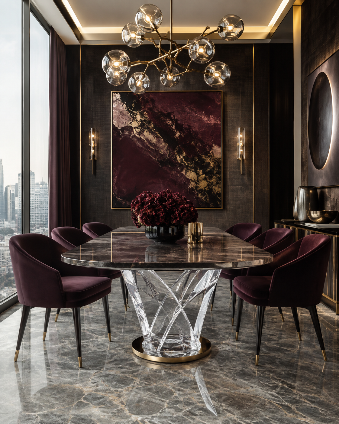
4. Light Is the Second Color of Transparent Furniture
A transparent table never has only one color.
It has its material color and the color created by the light around it.
The U.S. Department of Energy describes ANSI/IES TM-30 as a comprehensive method for evaluating how light sources affect the color appearance of objects. Unlike older approaches based primarily on average color fidelity, TM-30 uses 99 color samples and considers multiple dimensions including fidelity, gamut and hue-specific shifts. DOE guidance also emphasizes that a light source can make an architectural scene appear dull, vivid, natural or distorted depending on how colors are rendered.
This becomes particularly important with colored transparent furniture because light passes through the material rather than simply striking its surface.
A champagne resin reception desk under cool 4000K illumination may look restrained and contemporary. Under warm 2700K lighting, the same material can become noticeably richer and more golden.
An amber synthetic crystal side table placed beside warm decorative lamps can develop a glowing, jewel-like character. Under strong daylight it may appear lighter and cleaner.
Smoke-grey acrylic furniture behaves differently. It often benefits from directional lighting that catches polished corners and edges, preventing the dark transparent material from becoming visually flat.
Clear platinum acrylic can become even more dramatic. Because PMMA has strong light-transmitting properties, carefully positioned LEDs or concealed lighting can produce luminous edges. PLEXIGLAS specifically highlights acrylic's high light transmission and suitability for lighting and light-guiding applications.
This opens important opportunities for commercial furniture.
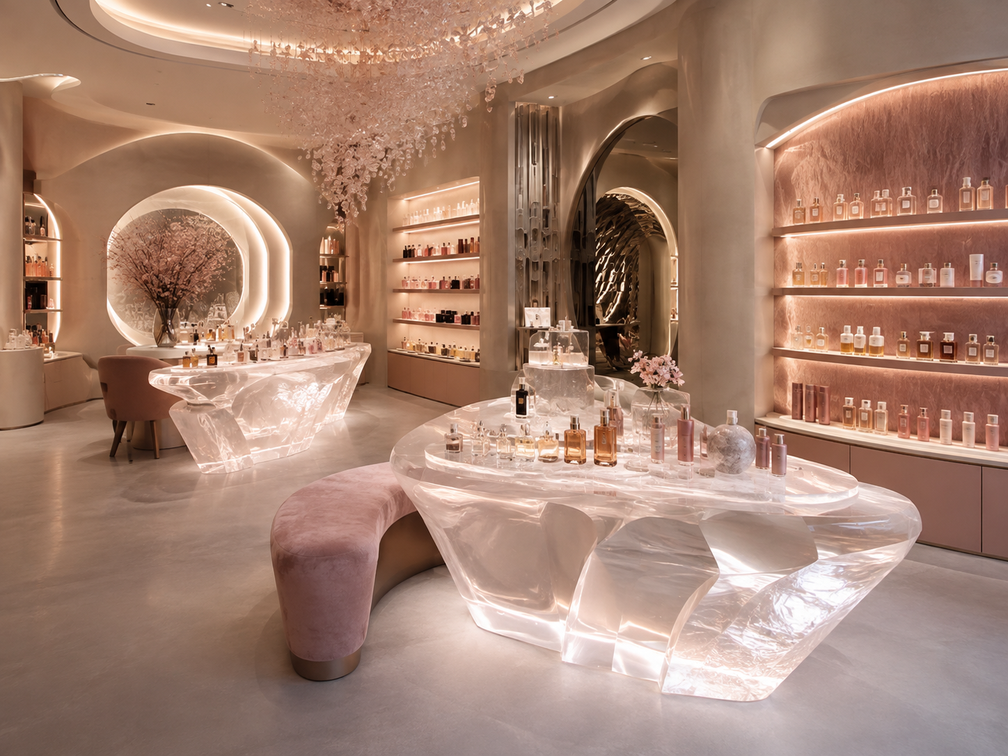
A clear acrylic retail pedestal can remain almost invisible during daytime trading and become a glowing merchandising platform in an evening event. A synthetic crystal bar counter can use concealed light to reveal its depth. A translucent resin reception desk can create a warm internal glow rather than requiring an additional decorative feature behind it.
But restraint matters.
If every edge is illuminated and every resin table contains intense color, the space can quickly move from luxurious to theatrical. Premium design typically creates hierarchy: perhaps the reception counter glows while surrounding tables remain quieter, or an amber statement console becomes the focal point while clear acrylic pedestals visually recede.
In transparent furniture, lighting should reveal material quality rather than compensate for its absence.
5. Premium Color Must Work With Stone, Metal, Timber and Textiles
Furniture rarely appears against a neutral background. Its perceived color is constantly influenced by surrounding materials.
This is why the most successful resin and synthetic crystal pieces are usually selected as part of a material palette rather than purchased independently.
Smoke-grey transparent furniture pairs particularly well with cooler architectural materials such as black stone, grey marble, stainless steel, chrome and dark timber. It creates a transition between solid dark elements and open space.
Amber resin works effectively with walnut, travertine, leather, bronze and other warm surfaces. Its transparency prevents these combinations from becoming excessively heavy.
Champagne synthetic crystal or premium acrylic can complement limestone, cream bouclé, pale oak and brushed brass. Instead of introducing a completely new color, it reinforces an existing warm-neutral palette.
Clear acrylic behaves almost like an optical neutral. Because surrounding colors remain visible through it, a clear console or coffee table can bridge very different materials without adding another competing surface.
This principle is particularly valuable in luxury retail. JLL reported that 59% of new U.S. luxury stores opened between July 2024 and July 2025 were located in street-retail environments, indicating the continuing importance of distinctive physical stores for luxury brands. In such spaces, furniture has to support both the architecture and the merchandise rather than compete with either.
Imagine a fine-jewelry boutique where gemstones and watches are the visual priority. Thick clear platinum acrylic or synthetic crystal display plinths allow the product to dominate while still creating a sense of precision and substance.
A fashion flagship may require stronger furniture identity. Smoke-grey resin tables can create structure within an open floor plan while maintaining sightlines through the store.
A premium cosmetics brand may choose pale champagne or blush-tinted resin furniture because the material can echo packaging colors while retaining the luminosity appropriate to beauty products.
Hospitality spaces create different requirements. A restaurant may use amber resin side tables because warm color reinforces an intimate evening atmosphere, while a corporate hotel lobby might prefer smoke-grey acrylic consoles to communicate a more international, architectural character.
There is no “luxury color” independent of context. High-end color is the color that makes every other material around it appear more intentional.
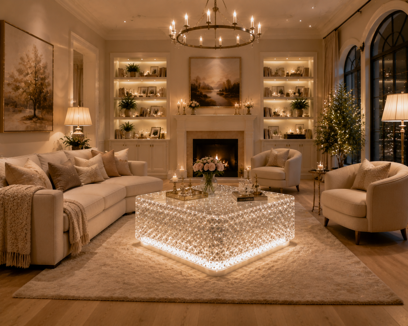
6. The Highest Level of Color Design Is Consistency Over Time
A piece of furniture does not demonstrate its real quality on installation day alone.
Luxury commercial furniture may remain in a hotel, boutique, restaurant or residence for years. During that period it is exposed to daylight, artificial lighting, heat, cleaning chemicals, fingerprints and repeated physical contact. Maintaining color is therefore part of maintaining perceived value.
This is especially critical for transparent materials, where even small changes are easier to see.
ISO 17223:2026 specifies an instrumental method for measuring yellowness index and changes in yellowness index in clear, translucent and opaque plastics. The standard specifically notes that changes in yellowness index are often used to evaluate environmental effects such as heat and UV exposure on color stability.
The implication for furniture specification is significant.
When a designer intentionally chooses amber or champagne, warmth is part of the product. But when a customer orders a colorless synthetic crystal console or clear platinum acrylic coffee table, an unintended yellow shift changes the design itself.
Color stability also matters when projects expand.
A hospitality group may purchase ten resin side tables for its first property and order another fifty two years later. A luxury retailer may install clear or smoke-grey acrylic pedestals in its flagship store before rolling the concept out internationally. If new production cannot visually match previous batches, the inconsistency becomes a brand problem rather than merely a manufacturing problem.
For this reason, premium furniture manufacturers should think about color as a controlled specification. Master samples, production records, optical inspection, pigment control and appropriate testing can all contribute to repeatability.
The same discipline applies to surface finishing. A highly polished resin or acrylic surface creates crisp reflections that increase perceived depth. As scratching and haze accumulate, color can appear duller even when the pigment itself has not changed. Maintenance instructions therefore become part of preserving the visual design.
Ultimately, the difference between material presence and premium appeal lies in control.
Synthetic crystal does not look luxurious simply because it is transparent. High-end resin does not become sophisticated simply because it is thick. Platinum acrylic does not create a premium interior simply because it has excellent clarity.
Luxury emerges when color, transparency, thickness, polish, lighting and surrounding materials reinforce one another.
A smoke-grey resin coffee table can make a minimalist lobby feel more architectural. Amber synthetic crystal can introduce warmth into a hospitality environment. Champagne acrylic can soften a neutral luxury palette. Crystal-clear premium acrylic can provide substantial furniture without reducing visual space.
The most successful pieces do not force customers to notice the material first. Instead, customers notice that the entire room feels calmer, richer, lighter or more refined.
That is the real logic behind high-end furniture color: the material should not merely have a beautiful color—it should make the space around it feel more valuable.
READ MORE:
- The Secret to an Expensive-Looking Interior: Why Designers Pair Transparent Furniture with Metal, Stone and Low-Saturation Colors
- Smoke Grey, Amber, Champagne or Clear? What Different Resin Furniture Colors Do to the Atmosphere of a Space
- Transparency Is Not Cheap: How Platinum Acrylic Furniture Elevates Interiors Through Color and Light
- How Can Commercial Spaces Avoid Looking Cheap? Start with the Color and Clarity of High-End Resin Furniture
- Synthetic Crystal Acrylic Furniture: A Material Trend That Cannot Be Ignored in the Future of High-End Design
- Why Can One Crystal-Grade Acrylic Furniture Piece Transform the Perceived Value of an Entire Space?
- Synthetic Crystal Acrylic Furniture: The Differentiated Answer the High-End Home Market Is Looking For
- From Transparent Aesthetics to Brand Elevation: How Synthetic Crystal Acrylic Furniture Enhances Product Positioning
- Synthetic Crystal Acrylic Furniture: Why High-End Clients Increasingly Value the Emotional Power of Material


