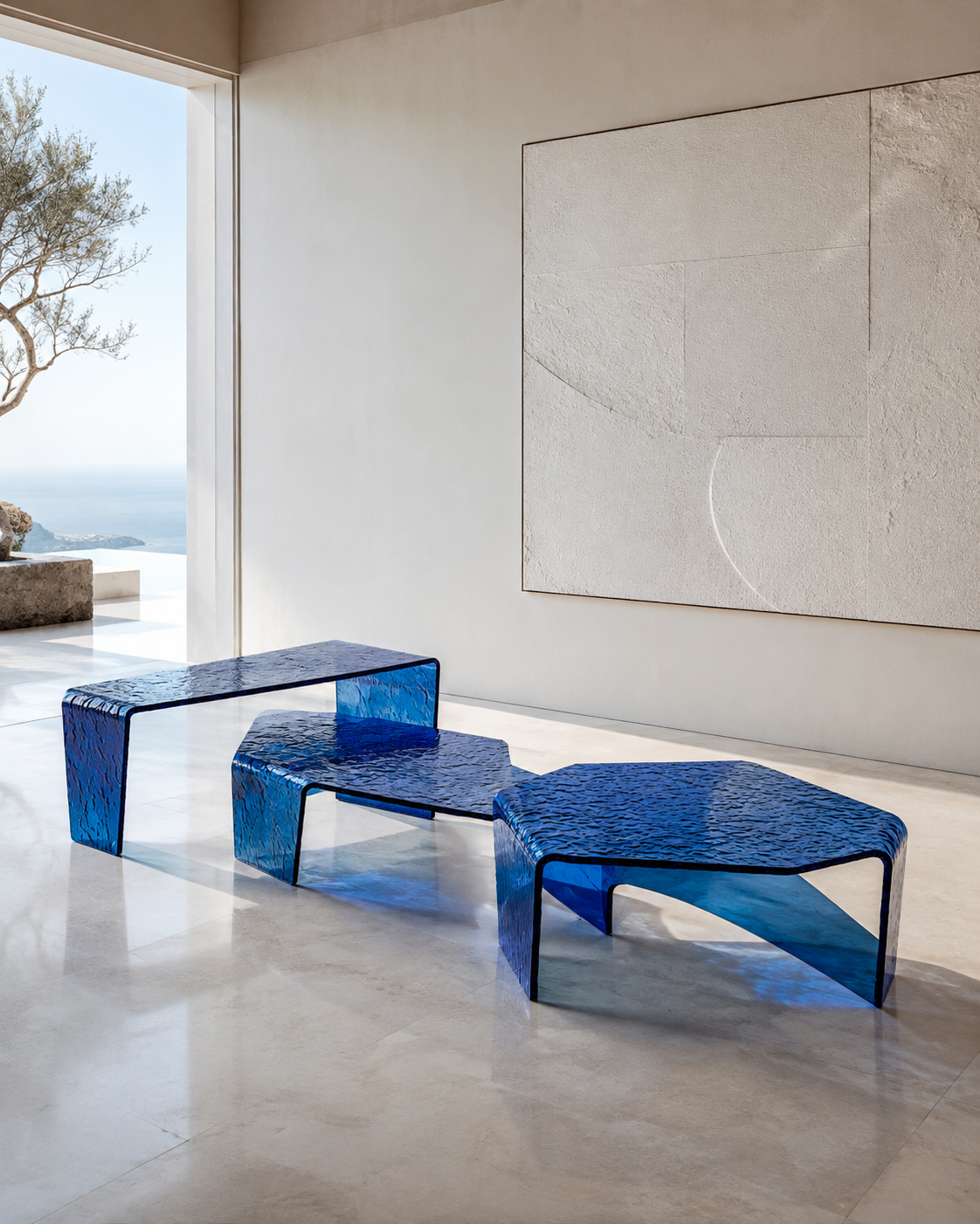

Color is one of the first decisions designers make when specifying resin furniture, but it is often treated too simply. A client sees four samples—smoke grey, amber, champagne and clear—and asks, “Which one looks more luxurious?”
There is no single correct answer.
The same transparent resin coffee table can communicate cool architectural sophistication in smoke grey, warm hospitality in amber, understated elegance in champagne, or almost invisible visual lightness in clear. More importantly, these colors do not exist independently. Their effect changes according to material thickness, transparency, surface polish, surrounding finishes and the color quality of the lighting.
This matters particularly in premium commercial interiors. Bain & Company and Fondazione Altagamma estimated global luxury spending at approximately €1.44 trillion in 2025 and highlighted a continuing shift from ownership toward experiences. Their research argues that luxury brands increasingly need physical environments capable of delivering emotion, immersion and personalized connection. In such environments, furniture is no longer simply functional equipment. It contributes directly to how customers experience a brand.
Color research also shows why this should not be reduced to simplistic rules. A recent systematic review covering 128 years of psychological research found consistent relationships between color categories and emotional associations, while also demonstrating that factors such as lightness, saturation and context matter.
For manufacturers and buyers of high-end resin furniture, synthetic crystal furniture and premium platinum acrylic furniture, the real question is therefore not “Which color is the most expensive-looking?” It is: “What atmosphere should this space create, and which transparent material and color can create it most convincingly?”
1. Furniture Color Should Be Selected for Atmosphere, Not From a Sample Card
The most common mistake in specifying colored transparent furniture is approving a color in isolation.
A 10-centimeter resin sample may look elegant on a desk, but that does not tell you what an 80-millimeter-thick coffee-table leg will look like inside a hotel lobby. Transparent materials accumulate color through depth. The longer the optical path through the material, the stronger an undertone can become.
This is one reason high-end resin, synthetic crystal and platinum acrylic furniture needs a different color-selection process from painted metal or timber. With an opaque cabinet, we primarily judge the surface color. With a transparent resin console, we see the surface, the interior of the material, the edge, reflections from surrounding objects and light traveling through several layers at different angles.
Color therefore becomes three-dimensional.
Research in hospitality environments supports the importance of considering color in context. A peer-reviewed study on hotel-room environments examined how spatial colors affected guests' perceptions, reinforcing the idea that color contributes to emotional and environmental evaluation rather than functioning as decoration alone. Other hospitality research has found that different color schemes can influence consumer attitudes and booking intentions, demonstrating that interior color can affect responses to a commercial environment.
In practice, this means a designer specifying a resin side table for a dark restaurant should not evaluate it under bright office lighting. A champagne resin table that appears almost colorless under 5000K lighting may become distinctly warmer under a 2700K pendant. A smoke grey acrylic plinth that seems elegant against white walls may become too visually heavy when placed against dark stone.
For important projects, the safest approach is to review material samples at meaningful thicknesses and under lighting conditions similar to the final space.
Luxury is rarely created by choosing a fashionable color. It comes from making the color feel inevitable within the environment.
2. Smoke Grey Creates Architectural Depth, Restraint and Visual Weight
Smoke grey is one of the most effective colors when transparent furniture needs to feel mature, controlled and architectural.
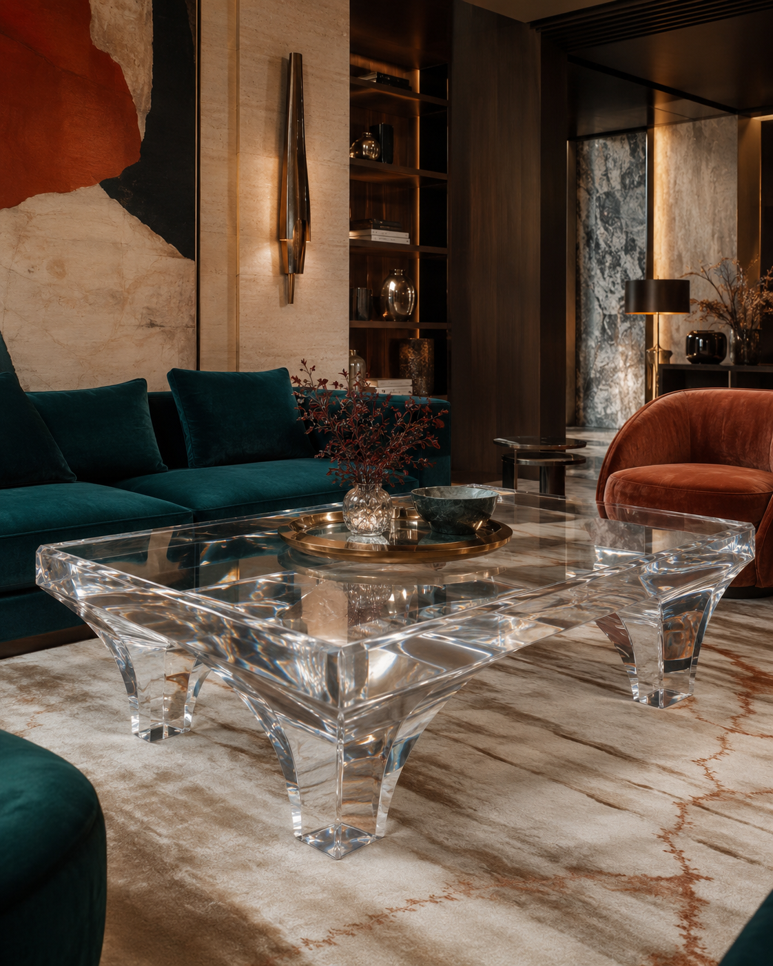
Unlike completely clear furniture, smoke grey creates a visible silhouette. It allows light to pass through while retaining enough density to define the object. This makes it particularly effective in contemporary luxury interiors where designers want transparency without visual fragility.
Consider a premium menswear boutique with charcoal stone flooring, brushed stainless steel and dark oak. A fully clear acrylic table may disappear too much against such materials. A smoke grey platinum acrylic display table creates greater visual weight while preserving transparency. The customer still sees the floor and products through the furniture, but the piece has a stronger architectural presence.
Smoke grey can also work effectively for high-end resin dining tables, synthetic crystal consoles, retail plinths and sculptural side tables. In a minimalist interior, the color can soften the transition between black, grey and metallic materials while preventing the room from becoming filled with opaque blocks.
However, grey needs to be controlled carefully.
The systematic review of color-emotion research found that grey frequently showed associations with lower-arousal emotional states. This does not mean grey furniture automatically creates negative emotion. It means context matters. In premium interiors, designers often use precisely that lower-arousal quality to create calmness, restraint and visual seriousness.
The difference between sophisticated smoke grey and dull grey often comes from transparency and lighting.
A high-quality translucent grey resin table still has internal luminosity. Highlights travel across polished edges. Reflections reveal the thickness of the object. If the resin is cloudy, overly dark or poorly polished, that depth disappears and the furniture can look heavy rather than sophisticated.
For luxury boutiques, corporate reception areas, contemporary restaurants and modern apartments, smoke grey works particularly well when the surrounding palette already includes stone, stainless steel, black, charcoal or cooler woods.
It is not the color for every project. But when a space needs confidence without excessive decoration, smoke grey is often one of the strongest options.
3. Amber Adds Warmth, Hospitality and a Sense of Material Richness
If smoke grey reduces visual temperature, amber moves in the opposite direction.
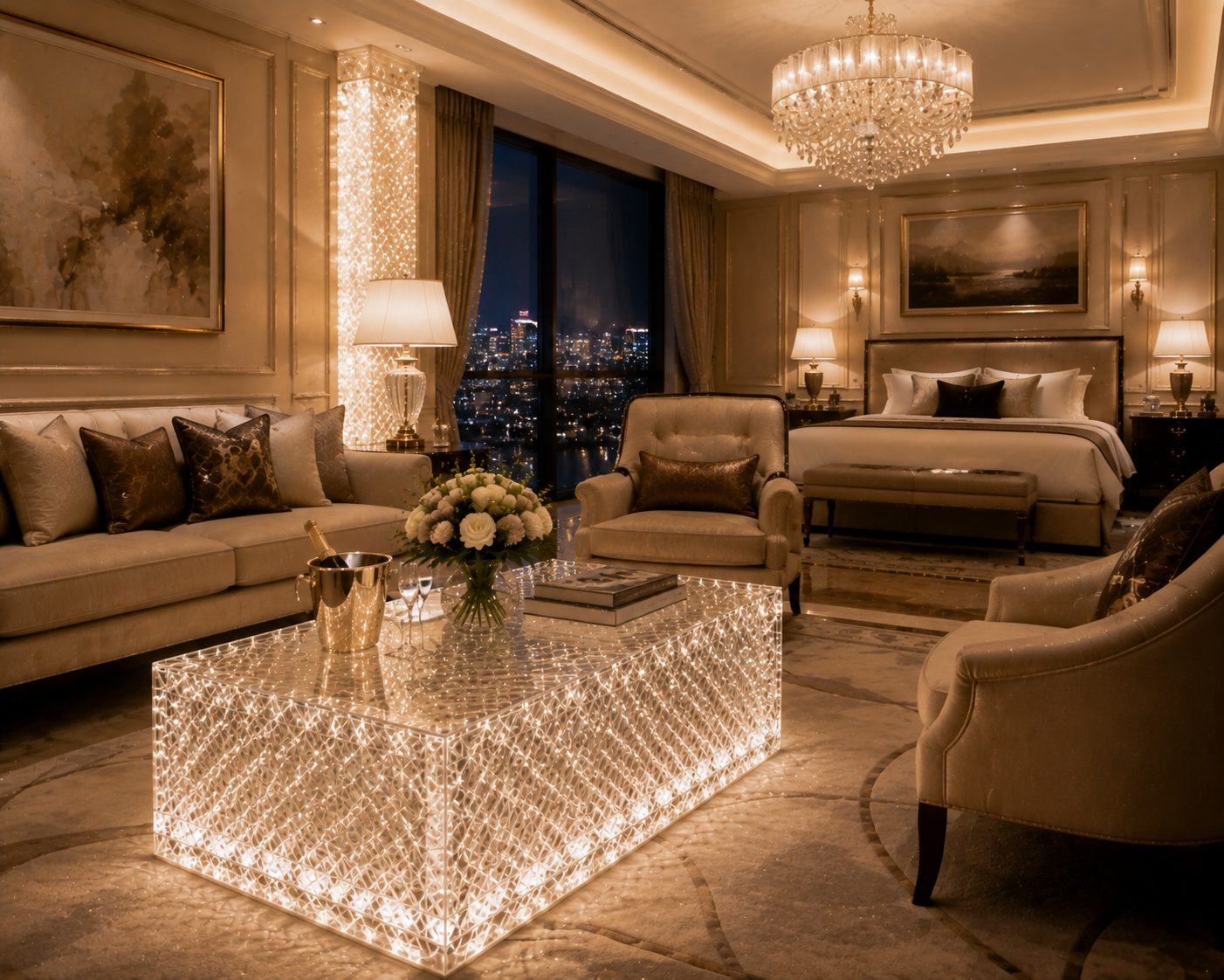
Amber resin furniture absorbs and transforms surrounding light, creating a warm glow that can make transparent material feel more tactile and emotionally inviting. This makes amber particularly effective for hotels, restaurants, lounges, private clubs and hospitality environments where the goal is not simply to look expensive, but to make guests want to stay.
Research into color and emotion offers some useful context. The large systematic review published through PubMed found that yellow and orange categories tended to be associated with positive, higher-arousal emotions across the literature it evaluated. Amber is not identical to yellow or orange, of course, but its location within a warm color family helps explain why designers often perceive it as energetic and welcoming.
The strongest results occur when amber is combined with suitable materials.
Imagine a hotel lounge containing travertine flooring, walnut wall panels, aged brass lamps and cream upholstery. A clear resin side table would preserve openness, but an amber high-end resin table can connect visually with the brass and timber while remaining transparent. Under warm evening lighting, its edges may appear more saturated than its center, creating the impression of depth similar to a large piece of polished mineral.
This effect can also be valuable with synthetic crystal furniture. An amber synthetic crystal stool or pedestal can function almost like an oversized decorative object while still performing as usable furniture.
The challenge is saturation.
Too much orange can quickly move from refined to decorative. In premium commercial furniture, slightly muted amber is often more versatile than a highly saturated tone because the thickness of the finished object naturally intensifies the color.
Lighting must also be considered. Under very warm light, amber becomes richer. Under cooler illumination, it may become cleaner and slightly less romantic. The U.S. Department of Energy notes that the spectral characteristics of a light source affect how object colors are rendered and describes IES TM-30 as a more comprehensive framework for evaluating color rendition than relying on a single traditional metric.
For amber furniture, that means lighting is not simply something placed above the product. It becomes part of the product's final color.
4. Champagne Creates Soft Luxury Without the Visual Heaviness of Gold
Champagne occupies an interesting position between clear and amber.
It has enough warmth to feel intentional but is usually restrained enough to maintain the lightness associated with transparent furniture. For this reason, champagne can be especially effective in interiors where obvious gold would feel too decorative and completely clear furniture would feel too cold.
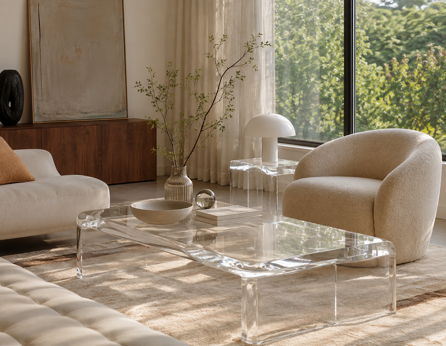
A champagne platinum acrylic console can complement brushed brass without trying to imitate metal. A champagne resin coffee table can sit beside beige stone and ivory upholstery without disappearing completely. A pale champagne synthetic crystal side table can introduce color while remaining visually quieter than amber.
This is why champagne is particularly suitable for luxury residential projects, beauty boutiques, bridal stores, hotel suites and sophisticated reception areas.
The key advantage is tonal compatibility.
Contemporary premium interiors often rely on layered neutrals rather than strong color contrasts: limestone, travertine, warm white, taupe, pale oak, bronze and brushed champagne metals. Transparent furniture in a subtle champagne tint can connect these surfaces while introducing another material category without breaking the palette.
But champagne is also one of the colors where material quality becomes extremely important.
A carefully formulated champagne tone should appear deliberate. Uncontrolled yellowing should not.
ISO 17223:2026 specifies a method for measuring yellowness index and change in yellowness index in clear, translucent and opaque plastics, noting that changes in yellowness index can be used to evaluate environmental effects such as heat and ultraviolet exposure on color stability.
That distinction matters commercially. A customer who orders champagne resin furniture expects the tone to be warm. A customer who orders a nearly clear platinum acrylic table does not expect it to become champagne-colored unintentionally.
For manufacturers, therefore, creating a premium champagne product requires controlled pigmentation, consistent casting, careful sample approval and attention to long-term color performance.
When those variables are controlled, champagne can deliver something that gold finishes often cannot: warmth without visual heaviness and luxury without obvious display.
5. Clear Furniture Creates Maximum Visual Space—but It Demands the Highest Optical Discipline
Clear may appear to be the simplest option, yet it is arguably the least forgiving.
With smoke grey, amber and champagne, color becomes part of the visual identity. With clear furniture, there is nowhere for unwanted tint, haze, bubbles, inclusions or poor polishing to hide.
That is precisely why extremely clear furniture can look so luxurious.
A thick platinum acrylic coffee table can occupy substantial physical volume while allowing flooring, rugs and architecture to remain visible through it. A synthetic crystal reception desk can feel monumental without creating the same visual barrier as marble. Clear high-end resin stools can provide seating around a restaurant bar without producing a row of opaque visual obstacles.
This combination of physical mass and visual lightness is difficult to achieve with conventional furniture materials.
Optical clarity, however, should not be judged only by eye. ASTM D1003 provides standardized methods for evaluating haze and luminous transmittance in transparent plastics and specifically identifies these measurements as useful for quality control and specification. ASTM explains that scattered light can create a hazy or smoky appearance even in a material that is technically light-transmitting.
Premium PMMA provides a useful technical benchmark. POLYVANTIS reports that clear PLEXIGLAS products can achieve visible light transmission of up to 92%. Its PLEXIGLAS Optical 0Z024 technical information lists 92% transmittance at 3 mm, at least 91% over a 150 mm light path and haze below 1% for that specific optical grade.
Those figures should not be assumed for every acrylic product, but they demonstrate the level at which transparency can be measured.
For clear platinum acrylic furniture, synthetic crystal tables and transparent resin consoles, buyers should therefore look beyond the word “clear.” They should evaluate clarity through the real furniture thickness, inspect polished edges, compare color neutrality against white backgrounds and examine the piece under strong directional light.
Clear furniture can look almost invisible from a distance. Up close, its quality becomes impossible to hide.
6. The Best Color Is the One That Works With Light, Material Thickness and Furniture Function
Smoke grey, amber, champagne and clear should not be ranked from “least luxurious” to “most luxurious.” They should be matched to the job the furniture needs to perform.
Smoke grey is effective when the furniture needs architectural presence while remaining transparent. Amber is particularly powerful when warmth, hospitality and richness are important. Champagne works when designers want subtle warmth and quiet luxury. Clear is ideal when visual openness and optical purity are the priorities.
But the final result depends heavily on light.
The U.S. Department of Energy explains that modern color-rendition evaluation through IES TM-30 considers multiple dimensions of how a light source changes the appearance of object colors, including fidelity and gamut-related characteristics. This is particularly relevant for colored transparent furniture because light does not merely illuminate the surface; it can travel through the object and interact with its edges and internal volume.
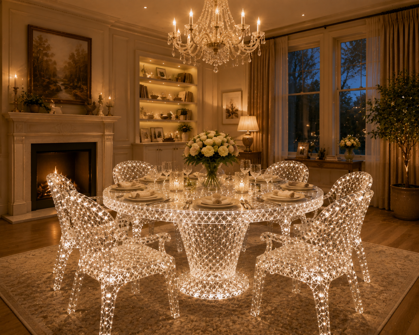
A smoke grey acrylic display pedestal under narrow-beam lighting may develop brilliant highlights along its polished corners. An amber resin table beneath warm decorative lighting can glow almost like illuminated stone. A champagne synthetic crystal console may appear nearly clear during the day and noticeably warmer at night. A clear platinum acrylic table positioned near concealed LEDs can transform from visually quiet furniture into an architectural lighting feature.
PMMA's optical properties also explain why acrylic is widely used in demanding light-management applications. PLEXIGLAS technical documentation describes high light transmission and suitability for light guides and edge-lighting systems, demonstrating how carefully processed acrylic can direct and interact with light.
This is why high-end commercial projects should ideally test furniture colors using the actual lighting concept whenever possible.
A physical mockup can reveal what a rendering cannot: whether the smoke grey becomes too dark, whether amber becomes excessively orange, whether champagne disappears against beige stone, or whether clear acrylic reflects nearby LEDs in an unwanted way.
The same discipline applies to furniture type. A subtle champagne tone may work beautifully in a large reception desk because the material thickness gives the color enough presence. The same formulation used in a thin shelf could appear almost colorless. An amber side table may be elegant as a single accent but overwhelming when repeated twenty times through a restaurant.
Color must therefore be designed at furniture scale, not sample scale.
Ultimately, premium transparent furniture succeeds when material, color and light behave as one system. Synthetic crystal, high-end resin and platinum acrylic are especially powerful because they allow designers to work not only with the surface of a piece of furniture, but also with light inside it.
That is the real difference between ordinary colored transparent furniture and a premium product.
Smoke grey can make transparency feel architectural. Amber can make it warm and inviting. Champagne can create understated luxury. Clear can make substantial furniture seem almost weightless. None is automatically superior.
The right choice is the color that supports the architecture, brand personality, lighting environment and customer experience while allowing the quality of the material itself to remain visible.
When that balance is achieved, color stops being a finish applied to furniture. It becomes part of the atmosphere of the entire space.
READ MORE:
- The Secret to an Expensive-Looking Interior: Why Designers Pair Transparent Furniture with Metal, Stone and Low-Saturation Colors
- From Material Presence to Premium Appeal: The Color Logic Behind Synthetic Crystal and High-End Resin Furniture
- Transparency Is Not Cheap: How Platinum Acrylic Furniture Elevates Interiors Through Color and Light
- How Can Commercial Spaces Avoid Looking Cheap? Start with the Color and Clarity of High-End Resin Furniture
- Synthetic Crystal Acrylic Furniture: A Material Trend That Cannot Be Ignored in the Future of High-End Design
- Why Can One Crystal-Grade Acrylic Furniture Piece Transform the Perceived Value of an Entire Space?
- Synthetic Crystal Acrylic Furniture: The Differentiated Answer the High-End Home Market Is Looking For
- From Transparent Aesthetics to Brand Elevation: How Synthetic Crystal Acrylic Furniture Enhances Product Positioning
- Synthetic Crystal Acrylic Furniture: Why High-End Clients Increasingly Value the Emotional Power of Material


