
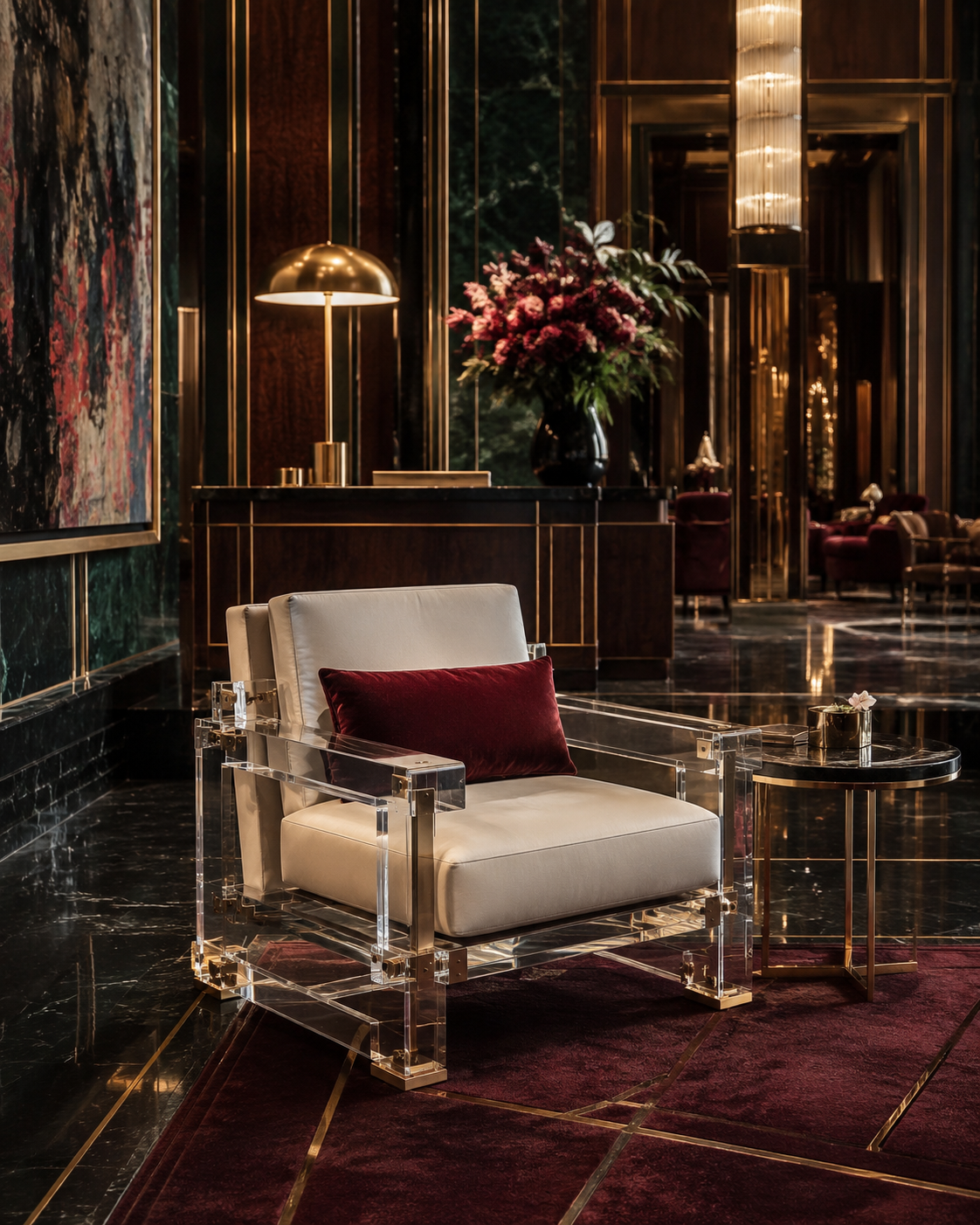
A commercial space can be expensive without looking expensive. A hotel lobby may use marble, brass, designer lighting and custom furniture, yet still feel visually “cheap” if its materials have inconsistent color, cloudy transparency, poorly finished edges or surfaces that age badly. Conversely, a relatively restrained interior can communicate luxury almost immediately when every visible material appears intentional, precise and controlled.
This matters even more today because physical commercial environments are increasingly expected to deliver an experience rather than simply provide a place to transact. Bain & Company and Fondazione Altagamma reported that global luxury spending was expected to reach approximately €1.44 trillion in 2025, while also identifying a structural shift toward experiences rather than possessions. Their recommendation for luxury brands was clear: physical retail needs to become more emotional, immersive and personalized. JLL similarly reported that newly opened luxury retail square footage in the United States increased 65.1% year over year in the first half of 2025, illustrating the continuing strategic importance of premium physical environments.
For designers, developers, hotel operators and luxury retailers, this changes how furniture should be specified. A resin table, synthetic crystal reception desk, transparent pedestal or premium acrylic console is no longer simply a functional object. Its color, optical clarity, edge quality and interaction with light become part of the customer's judgment of the entire brand.
1. “Cheapness” Is Usually a Perception Problem Before It Is a Price Problem
When people describe a commercial interior as looking cheap, they are rarely calculating what the furniture cost. They are reacting to visual signals.
An acrylic display that has a slight unwanted yellow cast, a resin table containing uncontrolled bubbles, or a transparent chair whose edges appear cloudy can immediately reduce the perceived quality of the surrounding space. The materials may still be expensive, but the customer sees inconsistency rather than craftsmanship.
Color is particularly powerful because people process it very quickly. A widely cited review published by Satyendra Singh in Management Decision reported that people may form an initial judgment within approximately 90 seconds and that color can account for 62% to 90% of that initial assessment. The study also emphasized that color can influence mood, attitude and product differentiation.
In a luxury commercial environment, therefore, color should never feel accidental.
Imagine a high-end jewelry boutique using transparent display pedestals. The designer intends the furniture to disappear visually so that diamonds and watches appear to float. If the acrylic has a noticeably cold blue edge, or if one pedestal is warmer than another, the eye begins noticing the fixture instead of the merchandise. The transparent furniture has failed at its job.
The same principle applies to synthetic crystal furniture and high-end cast resin. A champagne-tinted resin side table can look sophisticated because its warmth is deliberate. A supposedly colorless table that appears slightly amber because of resin formulation or aging looks very different. One communicates design intent; the other suggests material instability.
Luxury is therefore less about using the most expensive color and more about controlling color precisely. For commercial projects, designers should evaluate physical samples under the actual lighting environment, compare production batches against an approved master sample, and examine thick sections rather than judging only thin color chips. The thicker and more transparent the furniture becomes, the more obvious small differences in color become.
2. Premium Color Comes From Restraint, Consistency and Depth
One of the easiest ways to make transparent furniture look inexpensive is to treat color as decoration instead of material architecture.
Low-end transparent furniture often relies on highly saturated colors because strong color can hide inconsistencies in the material itself. High-end furniture can do the opposite. It can use subtle smoke gray, champagne, tea brown, ice blue, pale amber or completely colorless transparency because the manufacturing quality is strong enough to remain exposed.
This does not mean neutral colors are automatically luxurious. It means the color must make sense within the brand environment.
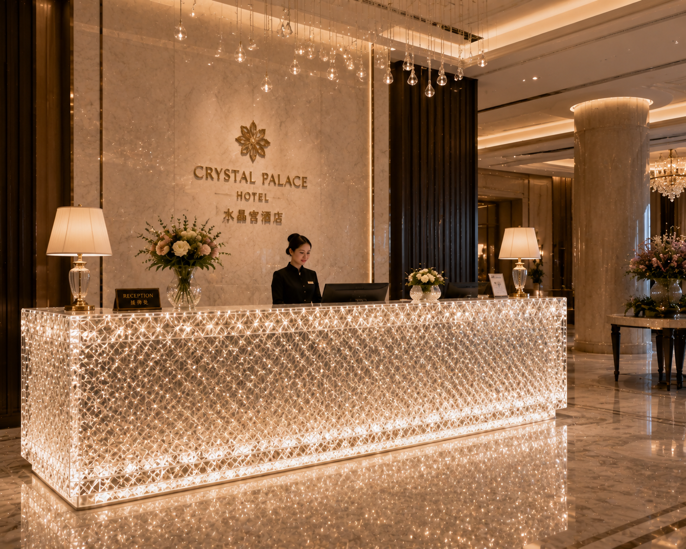
For example, a luxury cosmetics flagship may use a pale rose synthetic crystal table because the tone supports the brand's packaging. A premium hotel may specify a translucent amber resin reception console because the color works with warm stone and bronze. A fashion showroom may choose nearly colorless platinum-grade acrylic furniture to preserve the visual dominance of the clothing.
In each case, the expensive impression comes from coordination.
For transparent furniture, designers also need to distinguish between surface color and volumetric color. With opaque wood or painted metal, people mainly see the surface. With high-end resin, synthetic crystal and clear PMMA acrylic, light travels through the object. The customer sees color through centimeters of material, sometimes from several directions at once. Consequently, an undertone that appears almost invisible in a small sample can become much stronger in an 80-mm-thick table leg or sculptural base.
That is why specification should move beyond descriptions such as “clear,” “smoke” or “champagne.” Commercial projects should establish an approved physical standard and, where appropriate, use measurable color-control methods. In 2026, ISO published the second edition of ISO 17223, specifically covering the determination of yellowness index and changes in yellowness index for plastics. This is especially relevant when transparent materials are expected to remain visually neutral over time.
For architects and buyers, the practical lesson is simple: premium color is repeatable color. If twenty resin stools, acrylic plinths or synthetic crystal side tables are installed across the same flagship store, they should read as one carefully controlled material family rather than twenty slightly different production batches.
3. Transparency Should Be Specified as Optical Performance, Not Simply “Clear”
Transparency is one of the strongest luxury advantages of resin, synthetic crystal and premium acrylic furniture, but it is also one of the easiest qualities to misunderstand.
“Clear” is not a technical specification.
Two transparent materials can both be described as clear while appearing completely different in a finished commercial space. One may be crisp and almost invisible; another may have internal haze that becomes obvious under spotlights. One may preserve color through a thick section; another may develop a noticeable tint. One may have excellent polished edges; another may scatter light from machining marks.
ASTM International addresses this distinction through ASTM D1003, the standard test method used to evaluate haze and luminous transmittance in transparent plastics. ASTM explains that scattered light can create a hazy or smoky appearance and specifically notes that haze and luminous-transmittance measurements are useful for quality control and material specification.
That creates a far more useful conversation for high-end furniture procurement.
Instead of asking a supplier, “Is this acrylic very clear?”, a designer can ask how optical quality is controlled, whether haze and transmittance information is available, and how the material behaves at the thickness required for the actual furniture.
A useful benchmark can be found in the technical documentation for PLEXIGLAS Optical 0Z024, a high-clarity PMMA product. Its manufacturer reports 92% light transmittance at 3 mm thickness and haze below 1% under ASTM D1003. The same data sheet reports 91% transmission over a 150-mm light path for that specific optical grade. These figures should not be treated as universal values for every acrylic product; rather, they demonstrate how precisely optical performance can be documented.
The same mindset should be applied when purchasing high-end cast resin or synthetic crystal furniture. Large transparent coffee tables, reception desks, stools, retail pedestals and sculptural bases should be evaluated for internal bubbles, inclusions, haze, color shift and polish quality at realistic thicknesses.
True transparency does not merely allow light to pass through. It gives the furniture visual depth while keeping the material itself controlled.

4. Thick Sections, Polished Edges and Joints Reveal Whether Transparent Furniture Is Truly High-End
Transparent materials are unforgiving because they expose construction.
With timber, stone veneer or painted metal, many joints can be concealed. In a clear resin console or acrylic table, the customer can often see through the object and directly into the way it was manufactured. This makes edge finishing, bonding, casting quality and internal cleanliness extremely important.
Thick transparent sections are particularly revealing.
A solid synthetic crystal table leg may look spectacular precisely because its thickness bends and carries light through the form. But the same thickness will magnify an unwanted tint, trapped particle or casting defect. A high-end resin dining table can create a jewel-like sense of depth, while uncontrolled microbubbles can make the same piece resemble a low-cost decorative casting.
Edges are equally important. A precisely polished acrylic edge can capture and reflect light, creating a bright architectural line. A poorly machined edge scatters light irregularly and can appear white or frosted even when the main surface is transparent.
This is why furniture for luxury retail, hospitality and premium residential sales centers should be reviewed from more than the normal front viewing angle. Designers should inspect edges, underside surfaces, connection details and joints because these are exactly the areas that often distinguish engineered premium furniture from visually similar lower-cost alternatives.
Consider a luxury watch store using thick clear acrylic plinths. From five meters away, many materials may appear comparable. Under concentrated display lighting at close range, however, differences in polish, bonding, optical distortion and edge quality become obvious. The customer's eye may not consciously identify the technical defect, but the overall environment feels less refined.
For this reason, synthetic crystal, high-end resin and premium PMMA furniture work particularly well in sophisticated spaces when the manufacturer treats transparency as craftsmanship rather than simply as a material choice. The objective is not to prove that the furniture is plastic or resin. The objective is to let light, geometry and precision become part of the design language.
5. Lighting Can Make the Same Transparent Furniture Look Luxurious or Inexpensive
A furniture sample approved in a factory or design studio can look very different after installation because transparent materials do not have a fixed visual appearance. They interact continuously with the lighting around them.
A clear resin console positioned beside a warm 2700K decorative lamp can develop a warmer visual character. The same object beneath cooler retail lighting may appear more neutral or slightly blue. Colored acrylic can also become dramatically more saturated when illuminated from behind or through a polished edge.
For luxury projects, furniture and lighting therefore should not be specified independently.
The U.S. Department of Energy's guidance on the ANSI/IES TM-30 method explains that modern color-rendition evaluation goes beyond a single traditional color-rendering number and can assess characteristics such as color fidelity and gamut. DOE notes that TM-30 has increasingly been adopted by lighting manufacturers, specifiers and researchers because of its broader and more accurate characterization of color rendition. The Illuminating Engineering Society similarly describes TM-30 as a method that quantifies overall and hue-specific fidelity, chroma and hue shifts.
This has direct practical value for furniture.
In a cosmetics store, the lighting has to present skin tones, packaging and tinted resin accurately. In a jewelry store, concentrated light may intentionally create strong highlights along polished acrylic edges. In a hotel lounge, softer lighting may be used to turn a translucent resin side table into an atmospheric object rather than an almost invisible one.
The correct approach is to test the actual furniture material under the intended lighting specification. For especially important projects, mockups should include the same color temperature, beam angle and approximate light intensity expected on site.
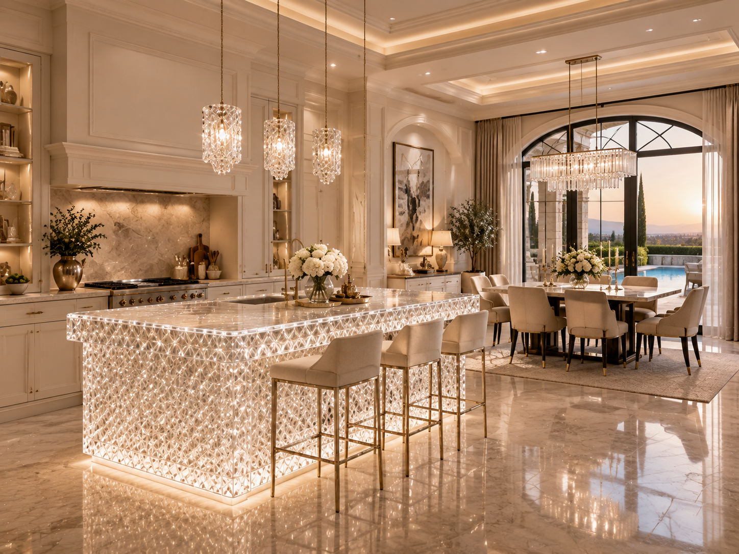
This is also where premium acrylic and synthetic crystal furniture can become architectural elements rather than ordinary furnishings. Edge lighting, concealed LEDs and carefully positioned spotlights can turn transparent tables, counters and partitions into luminous objects. When material clarity is high and the lighting is controlled, the visual result can feel lighter and more sophisticated than adding another expensive opaque material to the space.
6. The Final Test of “Luxury” Is How the Furniture Looks After Real Commercial Use
A piece of furniture does not remain inside a rendering. It is touched, cleaned, exposed to daylight, moved and photographed by customers every day.
That is why long-term appearance should be considered part of luxury specification.
Transparent furniture makes wear particularly visible. Fine scratches can gradually increase surface haze. Incompatible cleaning chemicals can damage surfaces. Resin formulations with insufficient light stability may change color. High-touch areas can lose their original gloss. Once clarity declines, furniture that originally made a space feel premium can begin doing the opposite.
International testing frameworks give project teams ways to discuss these risks more objectively. ASTM G154-23 defines laboratory practices for exposing materials to controlled fluorescent UV, moisture and heat conditions to evaluate weathering-related changes. ASTM D4674-25 specifically addresses accelerated testing of color stability for plastics in typical indoor office environments involving fluorescent lighting and window-filtered daylight. UL Solutions also identifies color change, loss of gloss, hazing, cracking and oxidation among the effects that accelerated weather testing can help evaluate.
For commercial buyers, this means material procurement should consider not only how a sample looks on day one but also how the manufacturer controls color stability, UV exposure, surface finishing, cleaning and repair.
A premium resin reception desk should arrive with appropriate care guidance. A synthetic crystal table placed beside a floor-to-ceiling window should use a formulation suitable for its exposure conditions. A platinum-grade acrylic retail pedestal should be designed so that normal maintenance does not rapidly destroy its optical quality.
The best high-end transparent furniture ultimately creates a contradiction: it looks visually effortless because enormous effort has gone into controlling it.
That is the difference between transparency that feels inexpensive and transparency that feels luxurious. High-end commercial spaces do not avoid “cheapness” simply by spending more money. They avoid it by eliminating visual accidents. When color is intentional, transparency is measurable, thick sections remain pure, edges are precisely finished, lighting supports the material and long-term appearance has been considered from the beginning, synthetic crystal, premium resin and high-quality acrylic furniture can become some of the most powerful luxury elements in the entire space.
READ MORE:
- The Secret to an Expensive-Looking Interior: Why Designers Pair Transparent Furniture with Metal, Stone and Low-Saturation Colors
- Smoke Grey, Amber, Champagne or Clear? What Different Resin Furniture Colors Do to the Atmosphere of a Space
- From Material Presence to Premium Appeal: The Color Logic Behind Synthetic Crystal and High-End Resin Furniture
- Transparency Is Not Cheap: How Platinum Acrylic Furniture Elevates Interiors Through Color and Light
- Synthetic Crystal Acrylic Furniture: A Material Trend That Cannot Be Ignored in the Future of High-End Design
- Why Can One Crystal-Grade Acrylic Furniture Piece Transform the Perceived Value of an Entire Space?
- Synthetic Crystal Acrylic Furniture: The Differentiated Answer the High-End Home Market Is Looking For
- From Transparent Aesthetics to Brand Elevation: How Synthetic Crystal Acrylic Furniture Enhances Product Positioning
- Synthetic Crystal Acrylic Furniture: Why High-End Clients Increasingly Value the Emotional Power of Material


